Soviet Montage Theory
Sergei Eisenstein's 5 methods of montage:
- Metric - cutting on beat
- Rhythmic - editing using rhythm of action in the shot
- Tonal - editing considering tone of shot
- Overtonal - large sequences
- Intellectual/ ideological - considering ideas
Luke Fowler: Two Frame Films
Luke Fowler is a Glasgow based artist who specializes in filmmaking and photography. This series of diptychs, named "two frame films" are created with a half-frame camera format. This format (diptychs) relates to Russian montage theory, introduced by filmmakers such as Serge Eisenstein in the 1920's. The idea of these photographs, comes from the photographer Fowler's series of half-frame photographs, that were published in the book 'Two-Frame Films'. Fowler uses a half-frame camera, which format makes the printing of two images in a standard 35mm frame, and so becomes one image overall, all of the images in his book were taken from the years 2006-2012. The diptychs reference the 'Theory of Montage', by Russian filmmakers in the 1920's, one of these filmmakers was Serge Eisenstein. Eisenstein believed that montage is 'an idea that derives from the collision between two shots that are independent of one another'.


Diptychs create a new image from two photographs. When you put two images together, whether they are taken in close proximity or have no apparent relation at all, they gain new meaning. Some of Fowlers diptychs have been taken very close in both proximity and time to one another and some aren't similar at all. Despite this, as the viewer we can find small details that create a vague correspondence between the images.

|
In this diptych, the images are connected visually rather than contextually. The two images seem to share not much in common besides the colour, implying they were taken at a similar time of day. This image shows that very loose similarities can still create a very strong connection between two images and tell a whole new story. Unlike some of his other photos, this photo uses a less direct connection between images. The framing is also something that gives the images the ability to be put together: they are very tightly framed and have very little context to them meaning they can be differently interpreted and go together well aesthetically as well. |
Response to Luke Fowler


I chose to put these photos together to make a diptych because I found they had similar shapes but in different context. The way the branch slants diagonally to the concrete and the way the cranes almost mimic the shape of the leaves and how the city mimics the shape of the trees creates an interesting pairing between the two. I went off of aesthetics to choose my photos so if I were to do this task again I would probably try to find more abstract relations between two images.
What is photopoetry?
the relationship between poem and photograph has always been one of disruption and serendipity, appropriation and exchange, evocation and metaphor


Photo-poetry is the mixing of photography and poems to create a new piece of work. Text and photographs become part of the same image and are given new meaning by each other. A photopoem is defined by the reception it receives and how the reader/viewer chooses to define it.
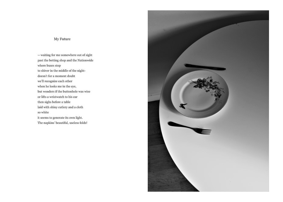
My Future
    |
To me this poem is about anticipation about what the future will be and the story of someone who is in a stage of their life where every day is the same, passing the same betting shop every day, waiting for a different day. The white cloth and the laid table act as a metaphor for this anticipation: the future is a meal that is yet to be served - it is "out of sight". I wanted to use this idea of anticipation in my photographs so that I could create a more vague link between the photo and the poem. I also recognised a certain level of conservatism about the end of the poem, almost as if the poet is waiting patiently in a metaphorical waiting room for the next part of his life. I went out to take photos and eventually narrowed my photos down to these 4. |
I decided to use this as my final image because I liked the metaphor of the person sitting before a table waiting for a meal to represent the anticipation they feel about the future and I believe this image captured that idea.
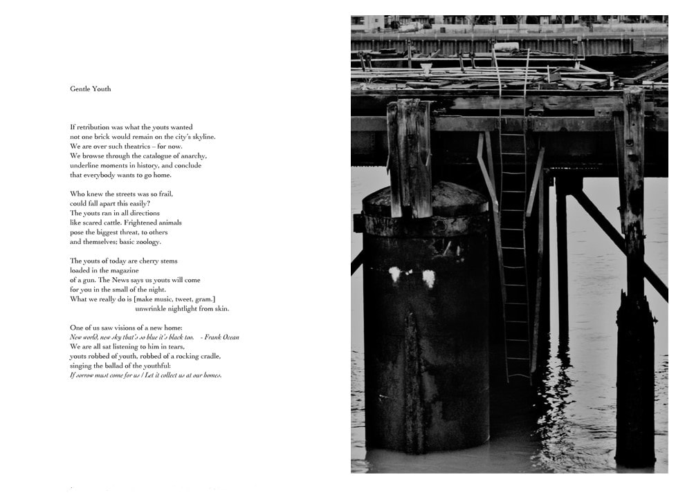
Gentle Youth
         |
This poem conveys the desperation and hopelessness that young people feel in the current age. I tried to capture that feeling of defeat through my images by finding photos of things that look abandoned and hopeless the same way the poem feels. The poem perfectly presents the loss of youth that our generation has felt in such a familiar way that it further emphasises it. |
Chinese Makars
Chinese Makars is a book composed of poetry, photography and language. The book contains 4 sections from different artists.


This is a collaboration between poets and photographers. Crawford's translations of work from four Tang Dynasty poets into Scots dialect and then into English prose are paired with John Thomas and Norman McBeath's photographs. the book is divided into four sections for each poet. Language is in itself a characteristic of this book. The way words translate differently in each language is one of the things that is played off of in this book, along with culture. The book also creates an interesting dynamic between photographs and language and the way translating and recreating art changes the way it is read or received.
More Image and Text Experiments
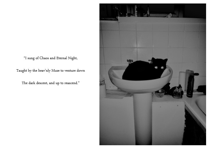
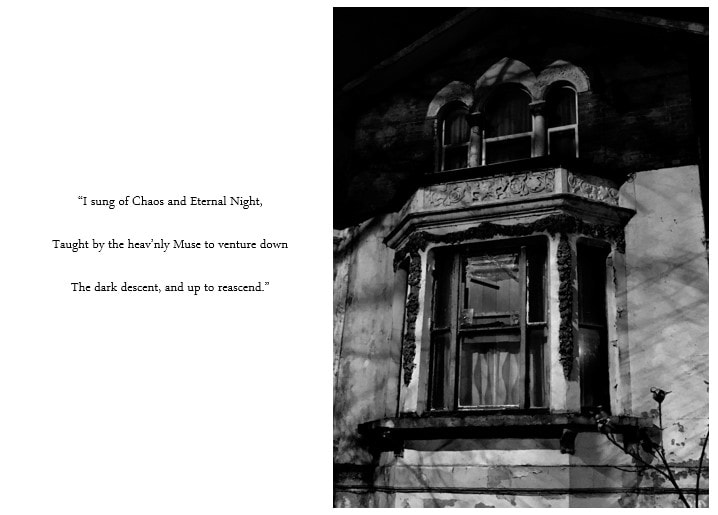
"I sung of Chaos and Eternal Night,
Taught by the heav’nly Muse to venture down
The dark descent, and up to reascend."
John Milton, paradise lost
Taught by the heav’nly Muse to venture down
The dark descent, and up to reascend."
John Milton, paradise lost
|

|
For this project I decided to go out to try and find text in public that I can re-contextualize with images. I found this sticker on a bus stop which I thought had an interesting message which I wanted to use.


Reclaiming language
We were given the task to take a piece of text from our environment and to decontextualize it to reclaim the language. I used a news article I found online about a man who found a fortune in his deceased fathers back garden that had been destroyed.

|

|
I thought that the words in the title seemed almost like a social commentary. Without the story, it seems like a sort of darkly ironic statement about the way we keep things hidden and act like we don't have them at all. I chose this picture because I found that the blurring of the figure walking also somewhat represents the ambiguity of the headline and the way we can interpret text differently.
Second photo

For this photo I used a letter I got from the post office from when I missed a package. I thought the message seemed quite funny as it seemed dismal and personal but in reality it was just a very literal message.
Chance pairings zine
Our task for this lesson was to pair images with text blindly to create associations we usually wouldn't between the two. I found that while some of the pairing were successful, some of the images went better with different text. Decontextualizing the words gives them amore abstract meaning and then when paired with other images, this meaning is changed completely.
We then connected this task to the mirrors and windows exhibition, first ordering just the pictures and then pictures and text combined and seeing how that changed the order.


Max Pinckers
|
Max Pinckers 'The Fourth Wall' is a series of recreations of real events constructed to look like Bollywood film sets, using the same lighting and backgrounds to create constructed scenes.
|


"it’s all fiction anyway, but fiction in search of truth is a powerful weapon.”


for this project we were instructed to make a series of photographs that represent something unphotographable, like a feeling, memory etc. I chose to base my series on my grandad. I went around places he used to live and took photos and then narrowed down to a few. I also went through some old things my dad kept of his and found loads of photos of him and poems he had written. I drew these over the images I took so that I could try to combine past and present in two different mediums. I also drew photos of birds and a chess board because when I was younger I would stay with him a lot we would play chess together or I would play with two little bird figures if he was busy. For this project I wanted to express the impact he had on the world before he died and how memories still go on existing around us after someone is gone. I tried to use this project as a way to immortalise the fond memories I and other people had of him.
Google Street View Photography


Mirrors & Windows
THE TWO CREATIVE MOTIVES THAT HAVE BEEN CONTRASTED HERE ARE NOT DISCRETE. ULTIMATELY EACH OF THE PICTURES IN THIS BOOK IS PART OF A SINGLE, COMPLEX, PLASTIC TRADITION. SINCE THE EARLY DAYS OF THAT TRADITION, AN INTERIOR DEBATE HAS CONTESTED ISSUES PARALLEL TO THOSE ILLUSTRATED HERE. THE PREJUDICES AND INCLINATIONS EXPRESSED BY THE PICTURES IN THIS BOOK SUGGEST POSITIONS THAT ARE FAMILIAR FROM OLDER DISPUTES. IN TERMS OF THE BEST PHOTOGRAPHY OF A HALF-CENTURY AGO, ONE MIGHT SAY THAT ALFRED STIEGLITZ IS THE PATRON OF THE FIRST HALF OF THIS BOOK AND EUGÈNE ATGET OF THE SECOND. IN EITHER CASE, WHAT ARTIST COULD WANT A MORE DISTINGUISHED SPONSOR? THE DISTANCE BETWEEN THEM IS TO BE MEASURED NOT IN TERMS OF THE RELATIVE FORCE OR ORIGINALITY OF THEIR WORK, BUT IN TERMS OF THEIR CONCEPTIONS OF WHAT A PHOTOGRAPH IS: IS IT A MIRROR, REFLECTING A PORTRAIT OF THE ARTIST WHO MADE IT, OR A WINDOW, THROUGH WHICH ONE MIGHT BETTER KNOW THE WORLD?
-- JOHN SZARKOWSKI, 1978


Mirrors and windows is an exhibition featuring different pieces of American photography from the past 20 years. The photos are split up into two categories: mirrors and windows. The point of the exhibition is not to divide the photos but to understand the reasoning behind them and what ideas they put across. Mirrors are used to reflect while windows are used to observe. Mirrors can be used to manipulate your reality and can be distorting while windows show the world to be exactly the way it is. There is an abundance of difference between the two but also a lot of similarity and so the photos featured, though they have been put on either a grey or white wall depending on whether the artist believes they are a mirror or a window, can still be taken in a different way from person to person and the discussion can be had because opinions are subjective.

Part 1: Mirrors


Mirrors can be used to symbolise many things and we use mirrors to see ourselves. That said, we can never really see who we are completely in a mirror because people mask their true identity even to themselves. Mirrors are used in all different art forms, including photography, fine art and literature and have become the archetype for spiritual reflection. These photos all represent something in the photographer rather than an aspect of the world around them and are made to be taken metaphorically.
Part 2: windows


Windows offer a more literal and straightforward perspective and reflect the world around the photographer rather than the photographer themselves. A lot of these images depict other people and make the viewer question the lives of those people rather than the life of the photographer. When I look at these images I think more about the image itself than what the person is trying to say with that image. For example, the photo of the man through the window doesn't give me any insight into the life of the person taking the photo but it does tell me something about the man in the picture.
Photo spectrum exercise
For this exercise, we had to put photos on a spectrum between windows and mirrors and decide ourselves where we would put it.


Photobook research:
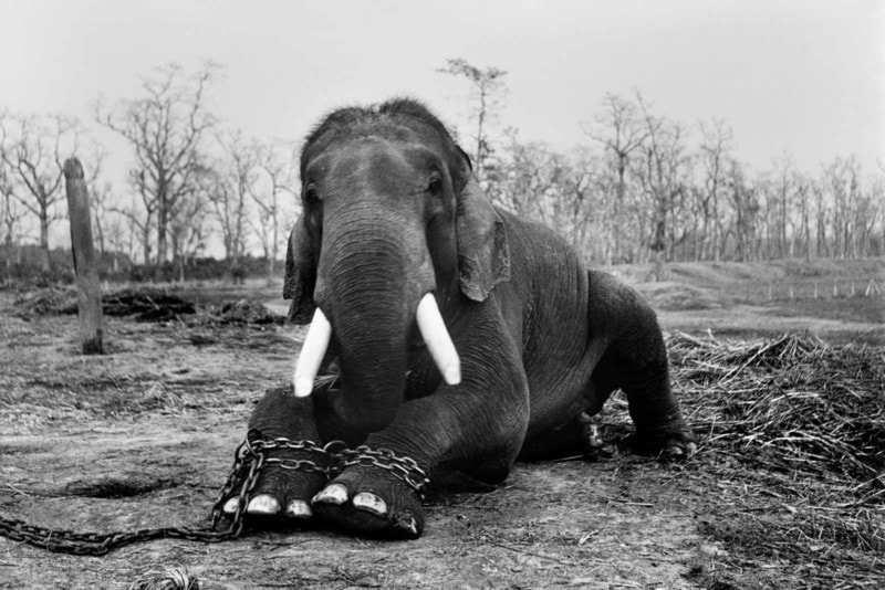
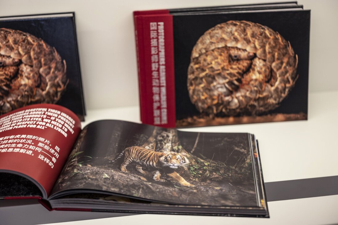
Book review-photographers against wildlife crime
This book is about jumpstarting a conversation about our relationship with wildlife and makes us question why we are still engaged in wildlife trafficking. It expresses the dire situation that the world is in and how what we do now in the next 50 years it pivotal to the future of the planet. I like this book because it shows the things that people are afraid to show and makes an impact on the viewer. It is quite a difficult book to read because it is so raw and real and it physicalises the things we know are happening in the world but we are usually able to disregard and compartmentalise. though the images are very intense, the book also contains text. This pairing of image and text makes it all the more influential, more than if it was only images or only text. Additionally, the way the images are paired creates a greater contrast because there is a combination of nice images and then images of the same animals abused by humans. this pairing really exposes the obliviousness that people have towards this subject and how they choose to just ignore the cruelty in the honour of consumerism.
|
|
Book review - Go no go - Ad Van Denderen
Ad Van Denderen photographs migrants and refugees and spent weeks in run down guesthouses in Istanbul, where human traffickers go to bring people across to border. He also joined police patrols along the border of Greece and Turkey matching the migrants paths.
Go no go seems to be a linear, photojournalistic investigation into migration and the lives of migrants. There are positive and negatives to this book. The way the images are composed is beautiful and captures the emotion of the situation, but I do believe photographers have a moral obligation not to be exploitative, and to use the photos we take for good, which I hope this book does.
Go no go seems to be a linear, photojournalistic investigation into migration and the lives of migrants. There are positive and negatives to this book. The way the images are composed is beautiful and captures the emotion of the situation, but I do believe photographers have a moral obligation not to be exploitative, and to use the photos we take for good, which I hope this book does.


Book review - rrreecconnstruccttt - Takashi Homma


The images in this publication were generated during a two-day performance held in Tokyo. Event participants were asked to select an original print by Takashi Homma. The photographer then cut the print into strips of varying shape. The fragments were handed to the participants, who then freely rearranged the fragments into new configurations. The completed recompositions were stamped by the photographer and then photographed. A selection of the reconstructed photographs were selected for this volume.
|
Page ayouts
|
Strength of photography
|
|
The pages are laid out in a way that makes the book interactive. They can be moved around and manipulated to the readers liking. This interactive aspect seems the be the main feature of the project.
|
There is a wide range of photos in the book but it seems that the quality of the photos themselves aren't as important as the way they're laid out and how the people at the exhibition and the reader themselves has chosen to order them.
|
The cover
The cover of the book is an extension of the theme of the photo-book. There are 25 cover designs with screen-printed lettering. Each copy has a randomised sequence. Customers will receive one of the 25 cover designs with randomised contents.
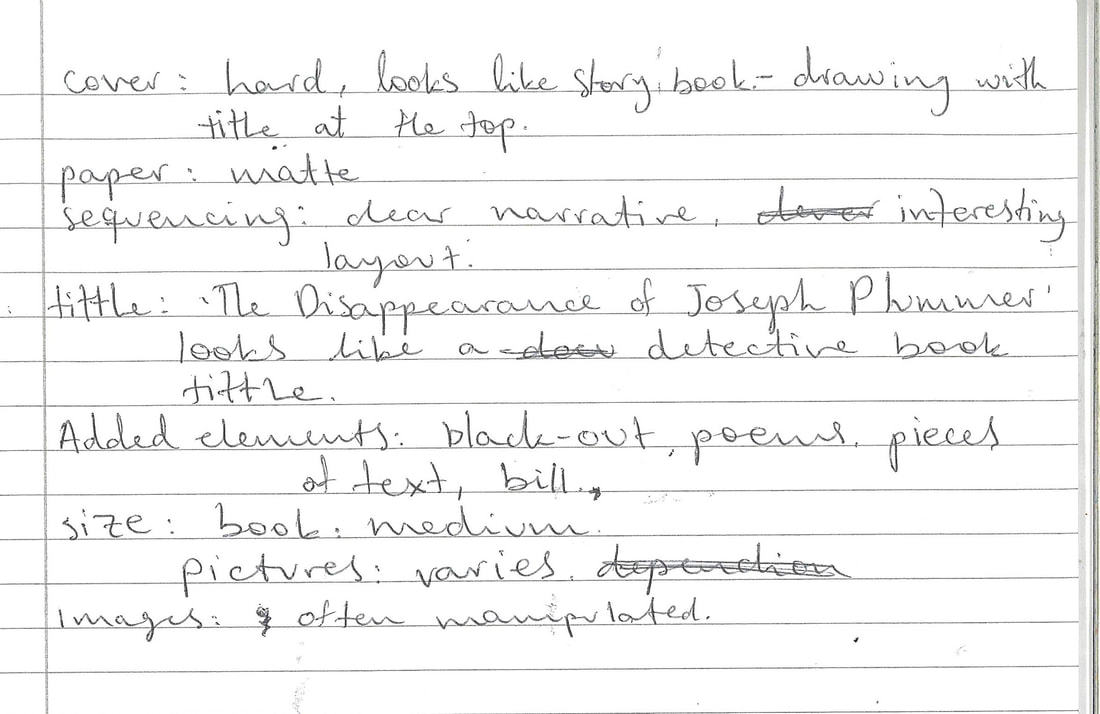
The disappearance of Joseph Plummer - Amani Willett
The book tells a story of a person who bought a cabin and discovered Joseph Plummer living in the woods. There are themes of the desire to be free and live outside the bounds of urban life in a rural paradise. The book is filled with different forms of text such as black out poems and non-fiction text. The way the book is presented through the cover is like a detective story, with a woodland illustration and the old looking gold text in the title.


Street photography based on a mood board of photos
As part of our personal investigation we were told to make a mood-board of images and then take pictures of our own based on the images we chose. I did a combination of colour and black and white photographs as a way of narrowing down what i would like to do in my photobook. I have chosen to do street photography as I find it interesting and I would like to explore it further.


Colour photos


Black and white


Critical feedback session
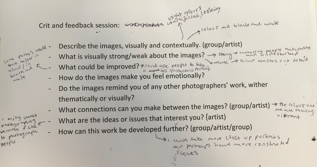
After receiving feedback on my images I have some more clarity on what I want to do for my photobook. I would like to do street photography for my photo-book and I would also like to start asking people to take portraits rather than taking them obscurely without the person seeing so that I could get a more constructed and close-up image, and give the subject some control over the image.
Photos from feedback


I don't really like a lot of these photos because it was my first time trying portraiture with people I didn't know and it was uncomfortable going up to people so I rushed the photos a bit and they didn't turn out as good as i had hoped but there are a few that I do really like. I also happened to be there on a day when there weren't many people about so I couldn't get many photos unfortunately.
Paul Graham - Photography is easy photography is difficult


Paul grahams article talks about the fluidity of life and how photography is about capturing moments. He talks about how this fluidity of life makes it difficult to find photos that are worthy and ones that are not. And whether a picture that is laboriously planned out is better than one that is taken on a whim and just happens to be a great photo, or if this laborious practice ruins the chance of photography. There is so much possibility in photography which can make it feel suffocating but you have to let the photos find you rather than searching for the perfect picture. The more you plan a photo, the less room there is for the surprise which is what makes photography so interesting to begin with. I really like Grahams view on photography because it allows the photographer to stop thinking about themselves and think about the world and how they can capture the world without being trapped by the idea of what a photo should look like and instead just let there be mistakes and embrace them rather than rejecting them.


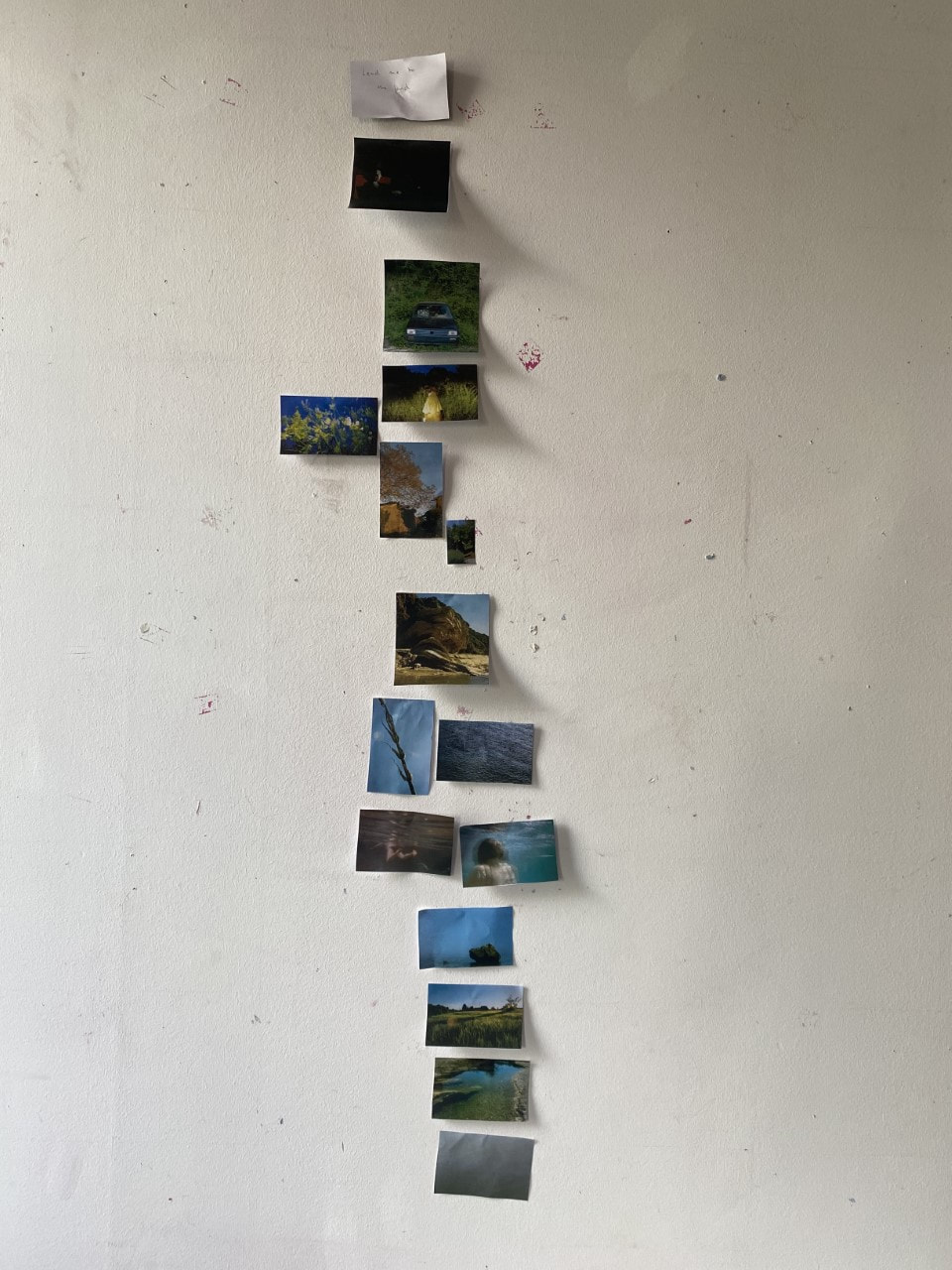
Sequencing - Lead me to the land
For this task we were given 25 images to work with and we had to choose 15 out of the 25 and put them a sequence following narrative and also taking into consideration formal elements such as tone, colour, composition, vantage point etc.


|
Our series of images was a story about a woman who drowns when her car breaks down. We used s similar colour scheme throughout the series of images to keep a sense of consistency and to make sure it was clear that there was a narrative in the images. The final images in my opinion are the most interesting because the stillness and silence of them is so palpable and really bring the story to a close. It depicts all these empty landscapes which contrast with the images of the girl drowning.
We were given the option to use text but opted against it because we thought it took away the ambiguity of the images. Without the text the story is entirely up to the readers interpretation over why she was there in the first place or whether she intentionally drowned or not. This task helped me understand the the importance of sequencing which I will try to keep in mind when I start ordering the layout of my photobook. I also believe that there are a few images that would have maybe been better to leave out of the final sequence, like the octopus on for instance. |
What kind of photographer am i?
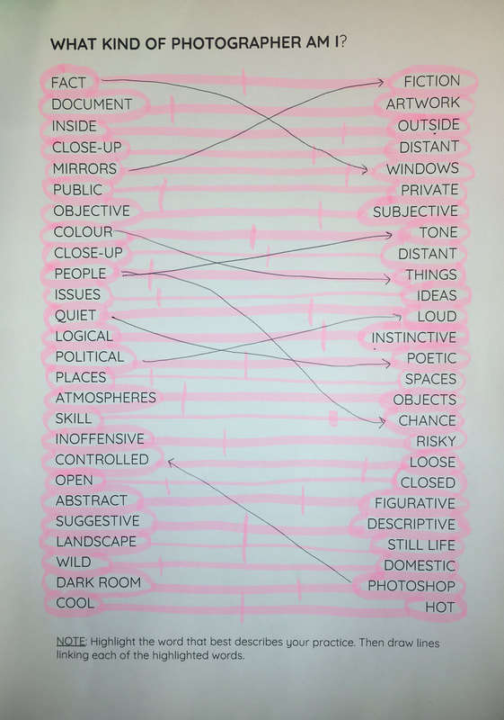
For this I made a spectrum between the words and put a line where I think my photographs fit most of the time. I also did arrows between words that I associate between each other regarding my images
Adama Jalloh: Process


Portraits in response


Half term photos


Portraits


Types of research

Playing with typeface
In class we experimented with typeface and researched some artists who use a combination of image and text in their work. We talked about the different typeface styles and how they affect the overall message of an image, such as Barbara Kruger, who's work resembles that of propaganda posters, or John Goldberg who's work was all hand written.


Photobook development: Narrowing down images


For my first set of images I went around different places taking pictures of things and people that I found interesting. The colours were important for me in the book and are a big part of the way the final book will be laid out. For this body of work I was interested in capturing the dynamic and colourful business of the city. I conveyed this through certain techniques of colour grading and tightly framed images.
Mock-book making


First dummy
I made my first dummy book to determine the sequencing of the book and to decide which photos went well together and which were better alone.
More images


Final dummy book
You Look a Bit Lost from Jon Nicholls on Vimeo.
Final photobook
This is my final selection of photos in the my photobook titled "You look a bit lost." My aim in the making of this book was to capture the dynamism and busy atmosphere I experienced living in London. The colourful and tightly framed images capture this feeling of claustrophobia but also how fascinating it is to live in a city and experience the way people and things interact. The title "You look a bit lost" was taken from a photo later in the book, which I edited into a font, keeping the structure of the letters. The title captures the idea that the book conveys of the busy and disorienting nature of the city.
